
Context
The skincare market is saturated with routines. Ten steps. Twelve steps. Forty serums promising forty different things, each one demanding a slot in a shelf, a budget, and a few more minutes of your morning.
Nu. starts from a different question: what if a skincare brand didn't try to sell you more? What if the entire brand existed to justify doing less?
This is a personal, self-initiated brand exploration — not a commissioned client project.
The Challenge
Designing "minimal" in the beauty space is not new — it's arguably the most crowded aesthetic in the category. Kraft paper, sage green, generic sans-serif logotypes: the visual language of "clean" has become its own cliché.
The real challenge wasn't to look minimal. It was to make the design itself argue for less — without borrowing the same three visual tropes every other clean-beauty brand already owns. Three constraints shaped the work:
Stand out in an oversaturated DNVB landscape without repeating its most familiar codes
Let the restraint be visible in the design decisions themselves, not just stated in the copy
Build a system disciplined enough to hold together across packaging, digital, and out-of-home — without fragmenting into disconnected pieces
Strategic Positioning
Mission
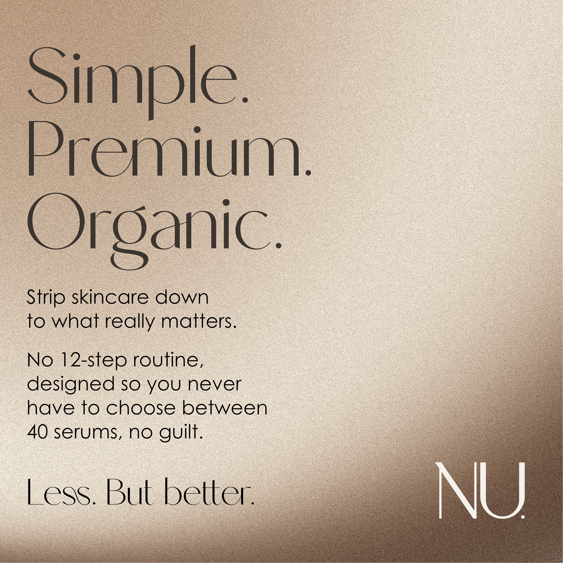
Strip skincare down to what actually matters. No twelve-step ritual, no guilt for skipping it.
Strip skincare down to what actually matters. No twelve-step ritual, no guilt for skipping it.
Target
Urban professionals, 25–40, worn out by the performance of "self-care" — they want skin that's doing fine, not a second job.
Urban professionals, 25–40, worn out by the performance of "self-care" — they want skin that's doing fine, not a second job.
Brand promise
Less, but better. A deliberately short range, so no one has to choose between forty serums to feel like they're doing enough.
Less, but better. A deliberately short range, so no one has to choose between forty serums to feel like they're doing enough.
Personality
Direct, honest, quietly defiant — never cold. Nu. talks like a friend saying "you don't need that," not a lab pushing another routine.
Direct, honest, quietly defiant — never cold. Nu. talks like a friend saying "you don't need that," not a lab pushing another routine.
Tone of voice
Short sentences. Zero beauty jargon — no "encapsulated actives," no "patented technology." A dry, understated wit. Comfortable saying no to trends.
Short sentences. Zero beauty jargon — no "encapsulated actives," no "patented technology." A dry, understated wit. Comfortable saying no to trends.
Creative Process
The project started from two references pulling in different directions: a warm, sculptural product shot (a jar photographed mid-use, cream lifted on a fingertip) and a macro beauty campaign built entirely around skin texture and typography floating over it.
Both pointed toward the same instinct — sensorial, tactile, unfiltered — but neither used Nu.'s palette. The early work was about translating that instinct into a warm amber-and-clay world: testing gradient textures with visible grain, moving the product from a tube to a jar for a more tactile, hands-on feel, and using AI-generated imagery to explore product and skin-focused visuals ahead of a full photo shoot — always generated blank, with design elements composited on top afterward for full typographic control.
The hand-drawn circle motif emerged during this phase, first as a small illustrative detail, then deliberately kept as a recurring brand device across the identity.
Identity System
Wordmark
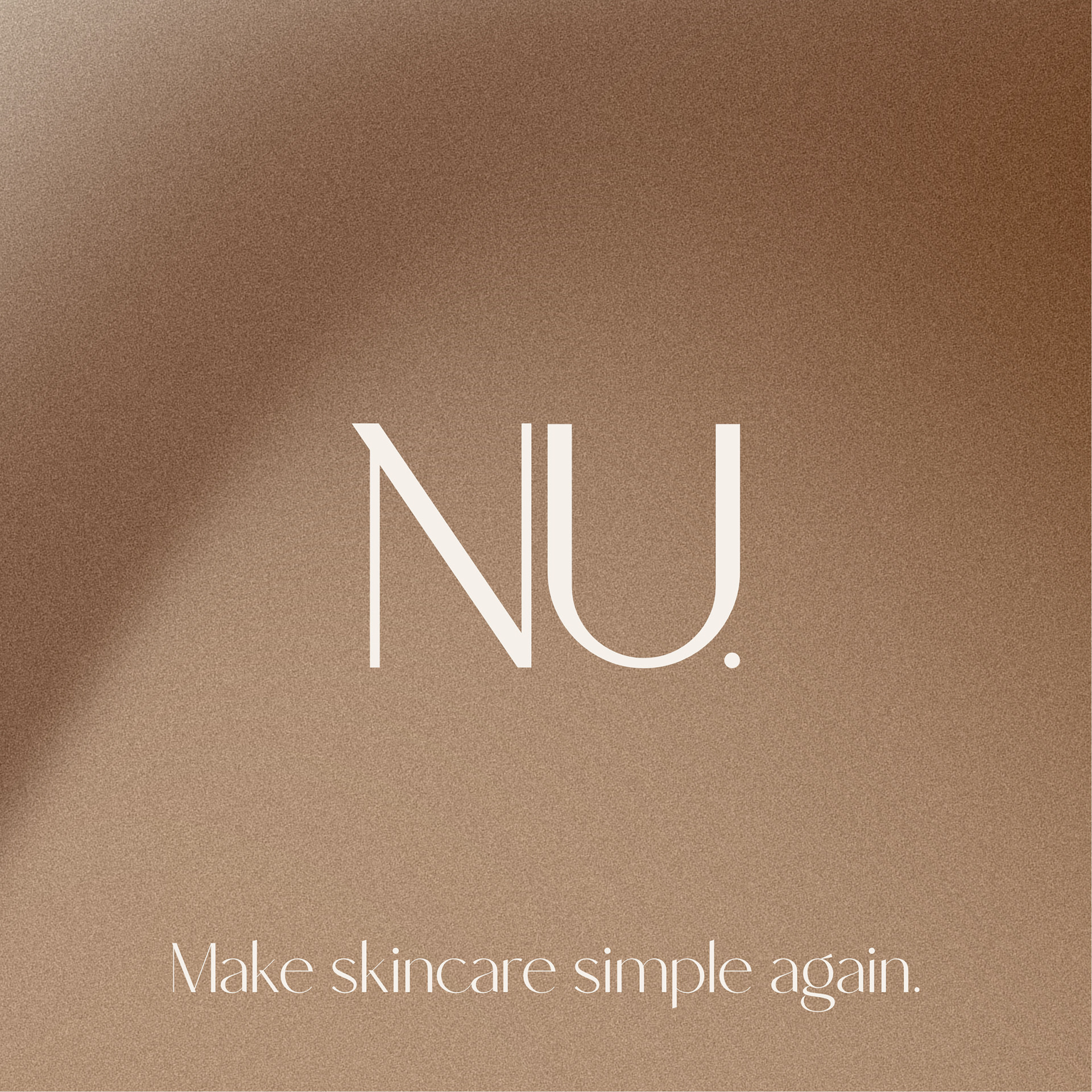
"Nu." — set in an editorial serif, the period kept as a quiet signature rather than punctuation. Short, direct, and legible at any size, from a jar cap to a subway poster.
"Nu." — set in an editorial serif, the period kept as a quiet signature rather than punctuation. Short, direct, and legible at any size, from a jar cap to a subway poster.
Palette
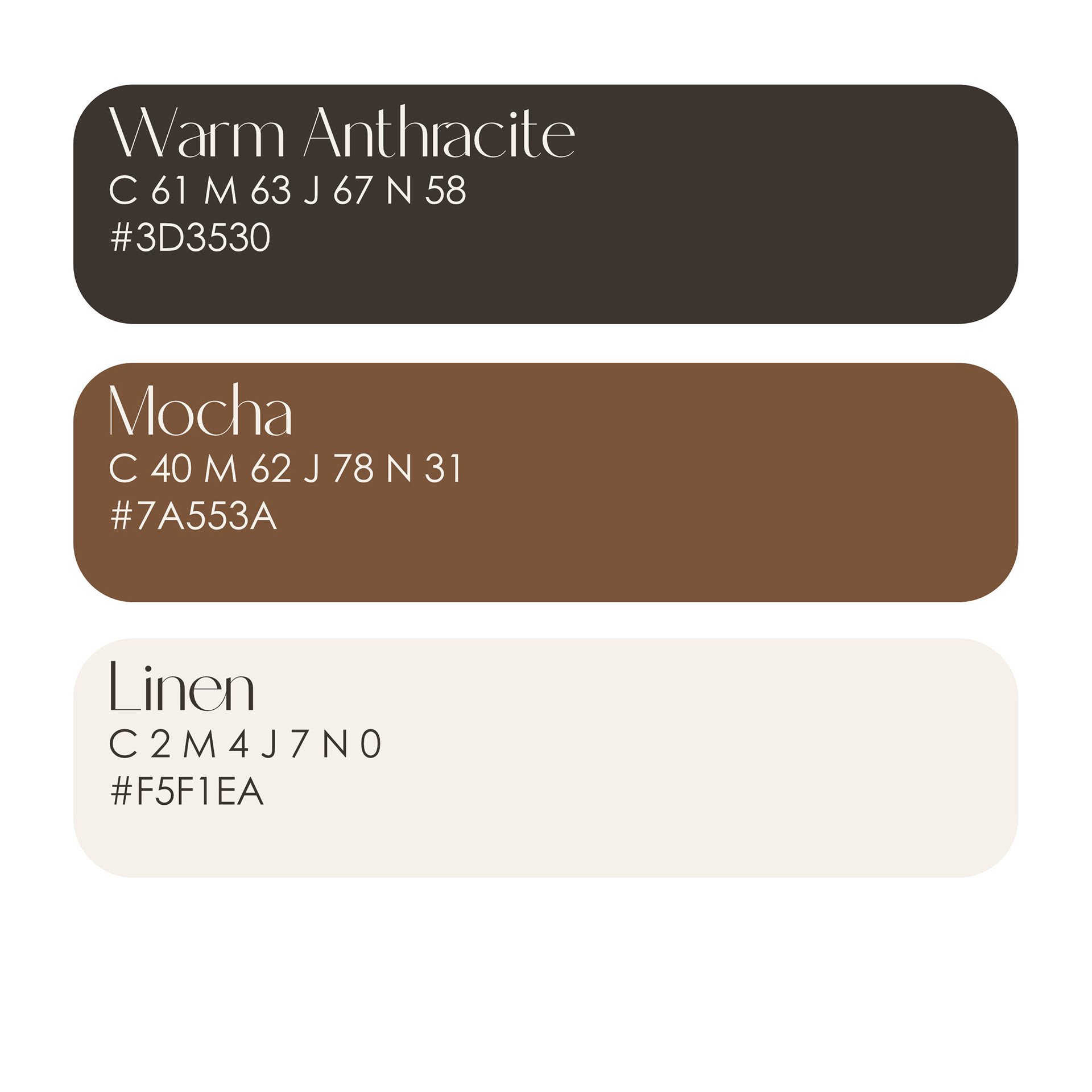
Warm Anthracite, Mocha & Linen — a tight, warm gradient built to read as premium without leaning on cold, clinical tones.
Warm Anthracite, Mocha & Linen — a tight, warm gradient built to read as premium without leaning on cold, clinical tones.
Typography
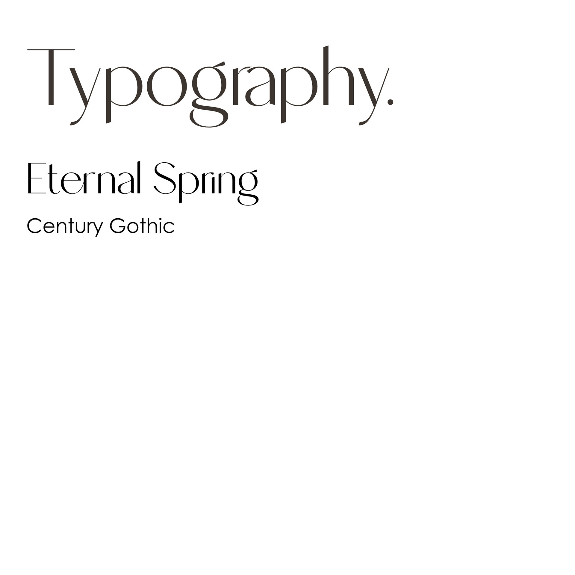
Editorial serif for headlines (Century Gothic paired Eternal Spring for display), a clean geometric sans-serif for body copy — enough contrast to feel considered, not decorative.
Editorial serif for headlines (Century Gothic paired Eternal Spring for display), a clean geometric sans-serif for body copy — enough contrast to feel considered, not decorative.
Signature motif
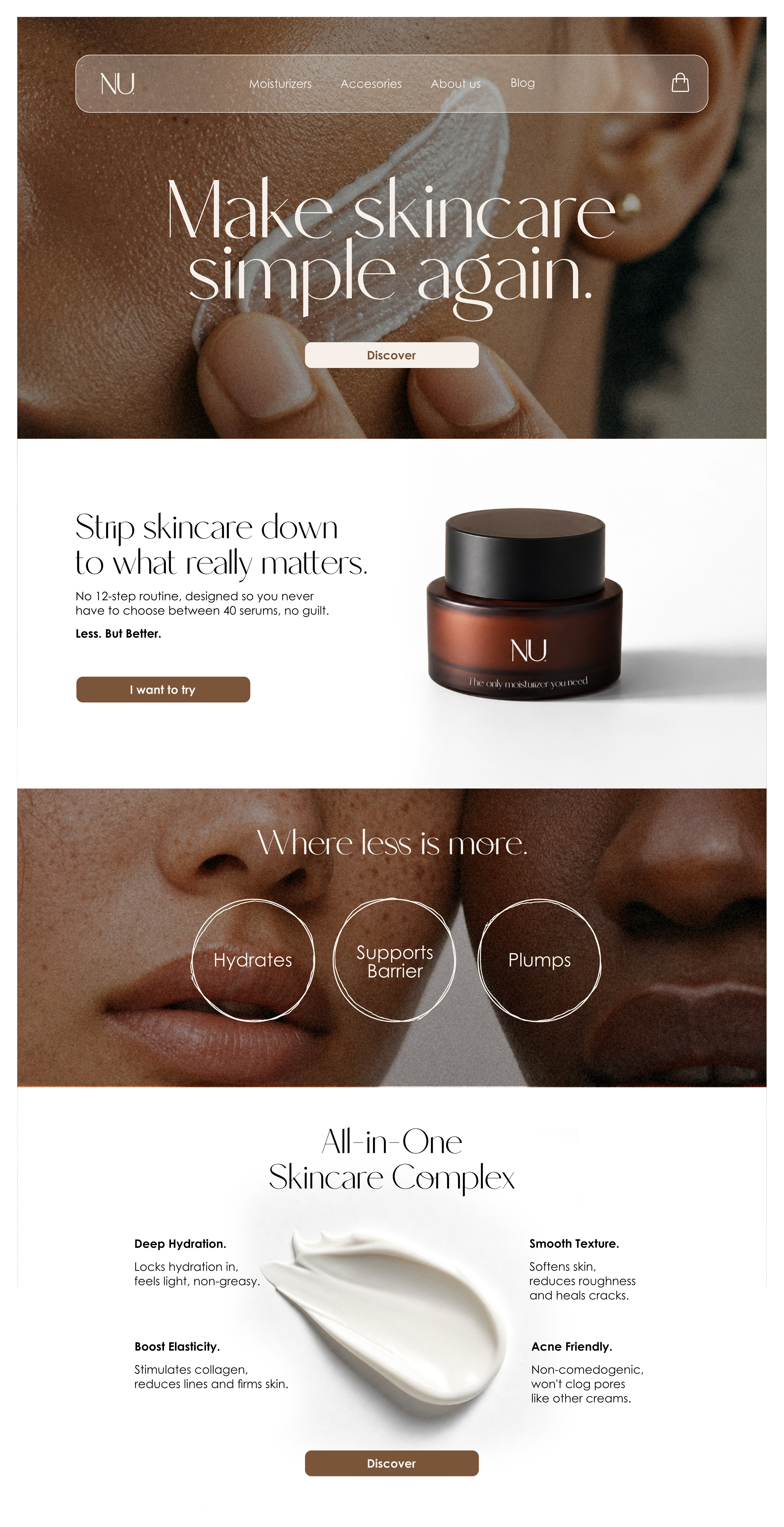
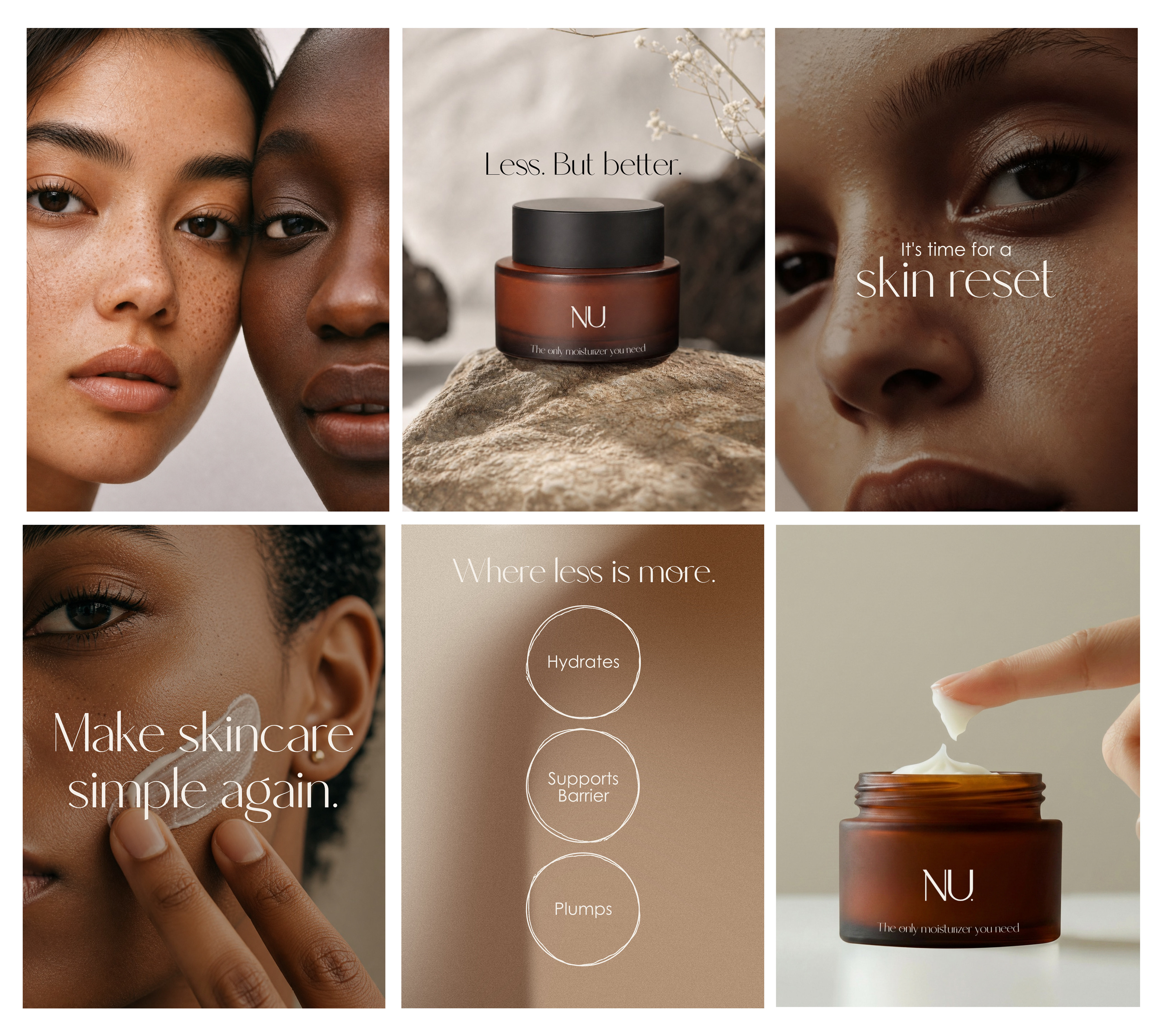
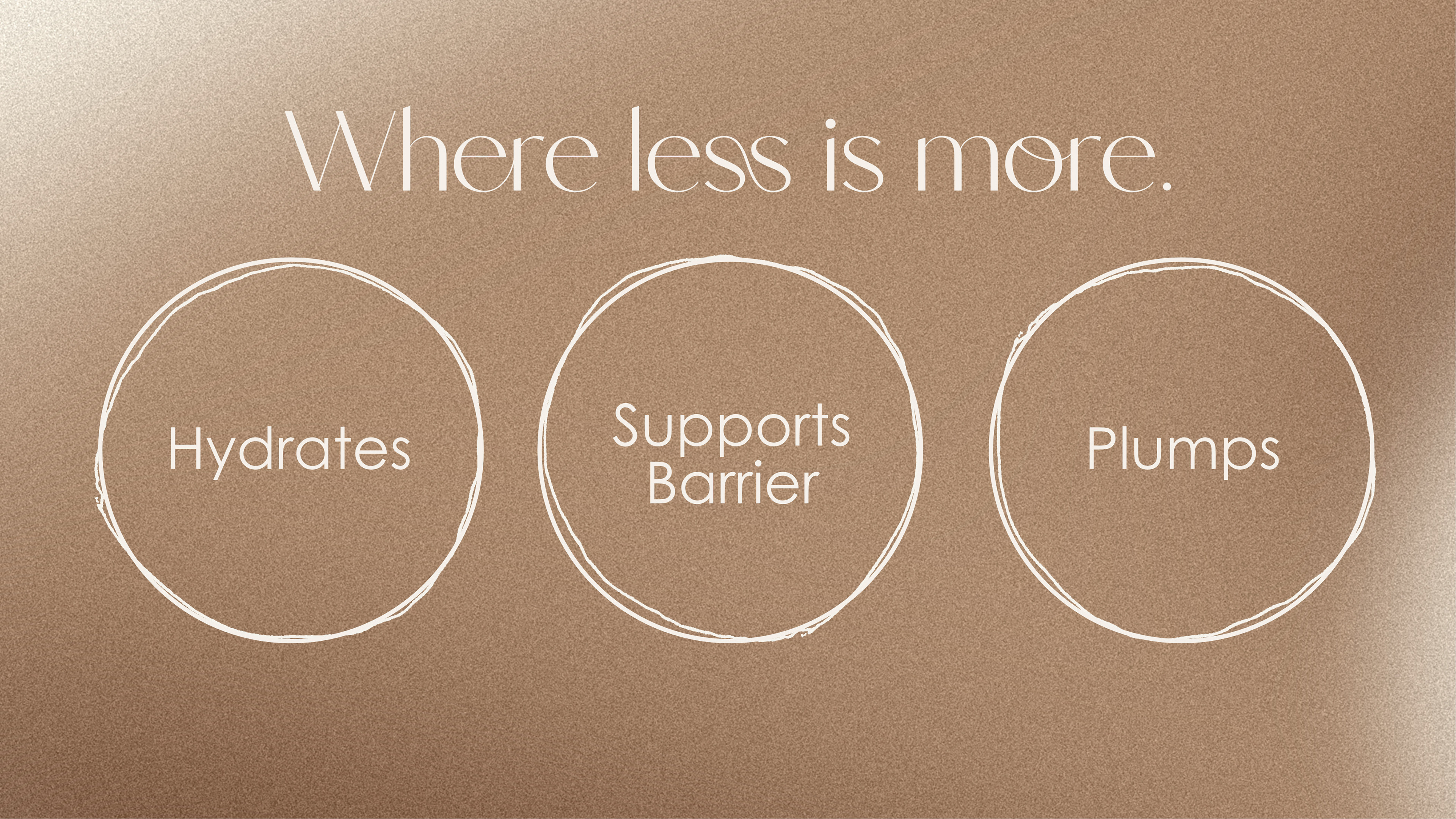
A hand-drawn circle, used singly or in a connected trio ("Hydrates / Supports Barrier / Plumps"). A simple, imperfect mark that stands in for the brand's whole idea: one gesture, not twelve steps.
A hand-drawn circle, used singly or in a connected trio ("Hydrates / Supports Barrier / Plumps"). A simple, imperfect mark that stands in for the brand's whole idea: one gesture, not twelve steps.
Applications
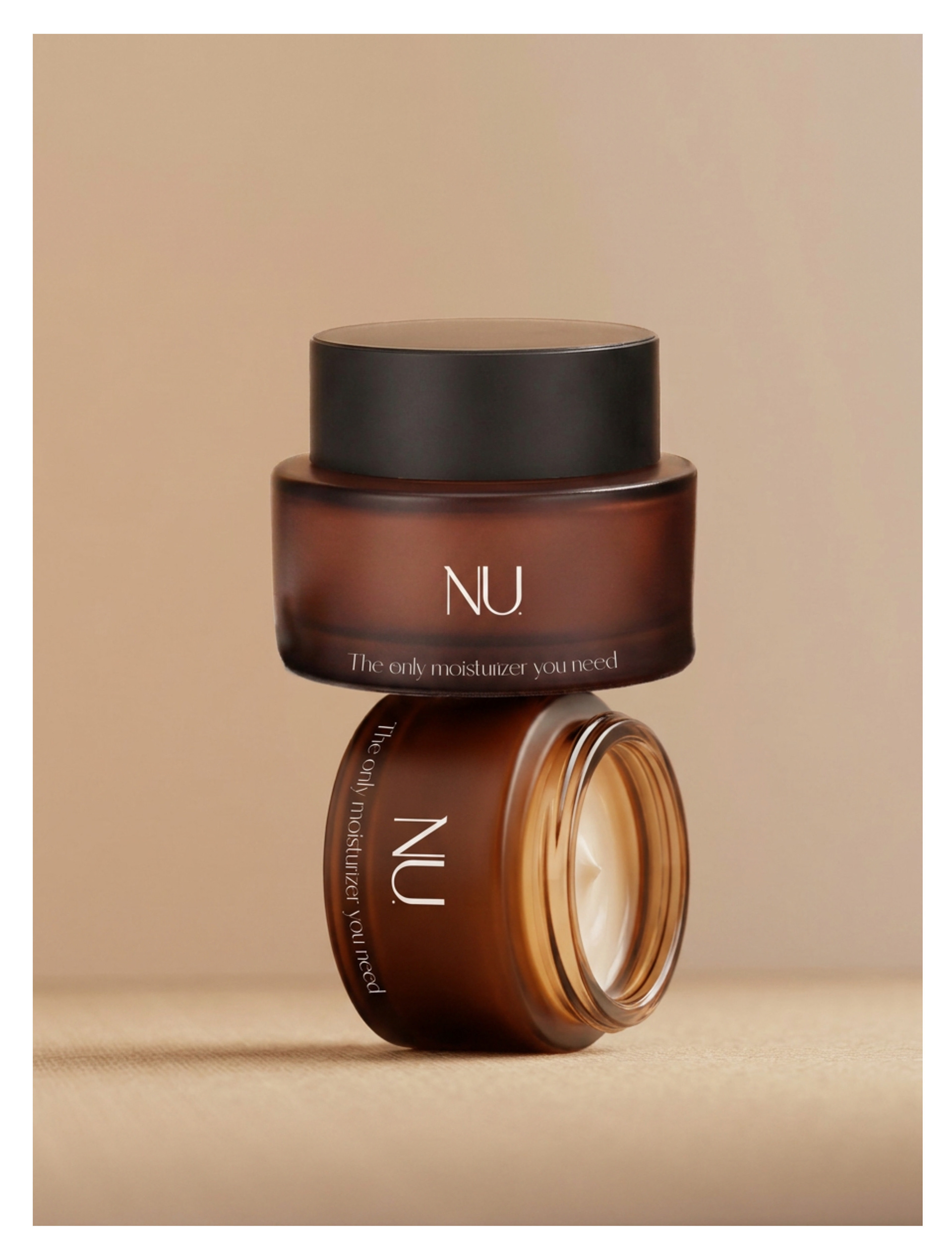
Packaging — an amber glass jar, the wordmark as the only graphic element on the surface, letting the material and the grain do the talking.
Digital — a single-product website built around one hero moment ("Make skincare simple again") and one clear CTA, reinforcing the brand's refusal to overwhelm the visitor with choice.
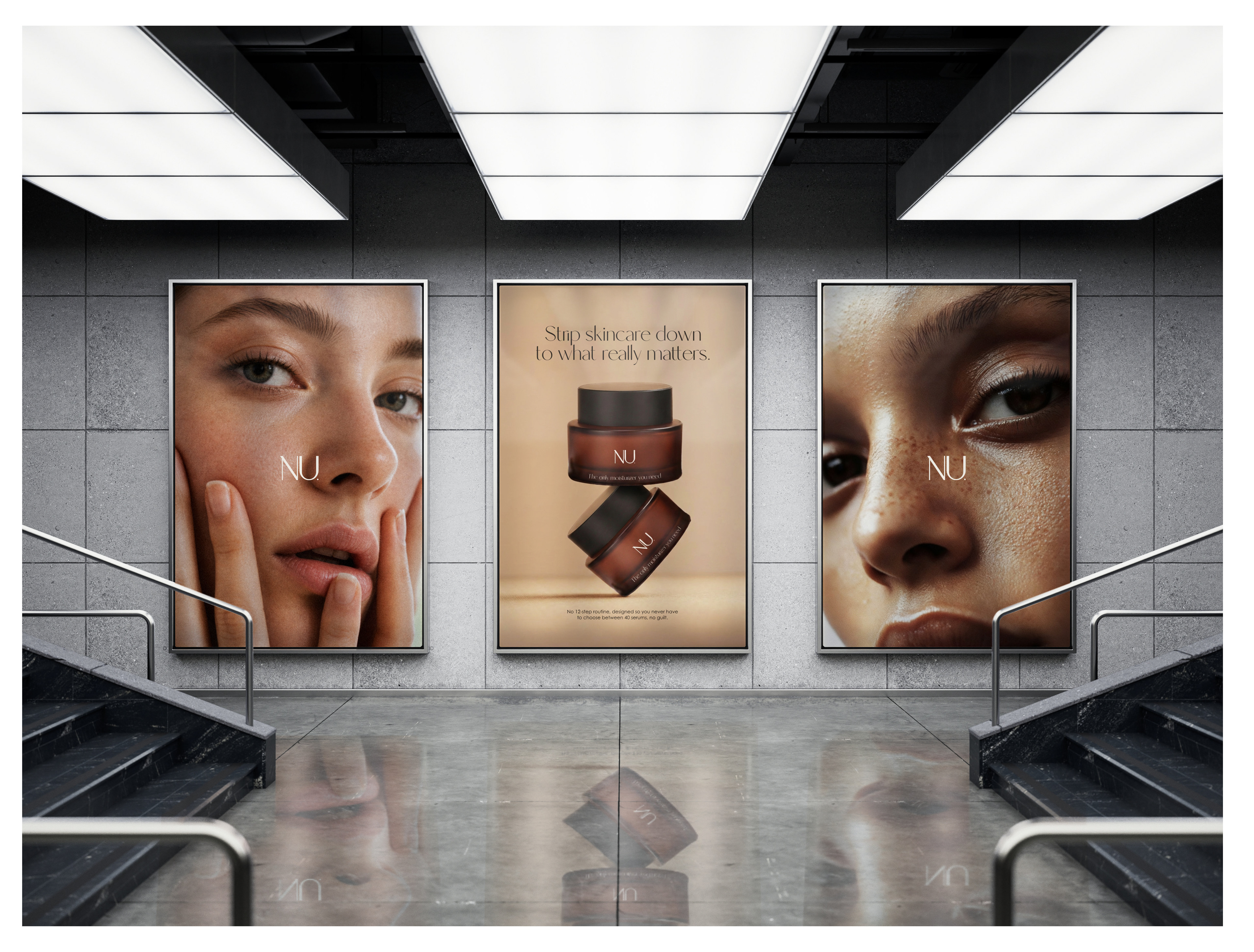
Campaign — a subway placement mixing macro skin photography with product shots, extending the identity into an out-of-home context without losing any of its intimacy.